Part Three was written by me, Alison D. Gilbert, The New York Graphic Design Examiner. It was published by the Examiner.com on February 4, 2011.
Charrette meets the ‘Big Apple’
THE BIG APPLE
It was not long after its official birth in 1964 that the owners of the Charrette Corporation, a well-established New England design supply institution, realized the opportunity to spread its wings and expand. The need for their multi-dimensional approach to the sale of design supplies was not limited to architects or its Massachusetts borders. Between 1968 and 2002, Charrette opened a total of 26 locations in 16 states, as far west as Chicago and Detroit and as far south as Washington, DC. The need that co-founders, Lionel Spiro and Blair Brown, had identified as students and started in a Harvard Graduate School of Design closet, was not exclusive to architectural students but was viable for designers and students everywhere.
According to Lionel, who came to be in charge of the NY stores, “In 1967, the first NY store opened. It was located on the second and third floors of 139 East 47th Street. After a short time, the need for a better and larger location was apparent and the store moved to a brownstone building at 212 East 54th Street.
“Its showroom/store area was on the main floor and some storage was in the basement. By then, Charrette ran a truck from Boston to New York every night which enabled customer orders and store restocking to be done from its 125,000 square foot warehouse containing 36,000 different items. This enabled Charrette to accept telephone orders from customers in NYC up to 5:30 and deliver the orders with a 96% fill rate, the next morning.”
When the parcel of land containing the Charrette store on East 54th Street was demolished to make room for the ultra-modern ‘Lipstick Building’, the store had to move once again choosing a larger space at the corner of Lexington Avenue and 33rd Street.
The establishment of Charrette’s permanent New York home necessitated the skills of an architect to design their very own showplace from a barebones office space in the design district. For this task, Lionel turned to one of his Harvard Graduate School of Design classmates, New York based architect, David Paul Helpern. Mr. Helpern is still practicing and it was possible to interview him to learn more about the design and building of the showplace that was Charrette’s home for 20 years. Upcoming articles in this series will include excerpts from that interview and more about Charrette’s NY graphic standards.
LINKS TO THE CHARRETTE CORPORATION CHRONICLES: PART ONE THROUGH FIVE
This series of blog posts about KNOLLING is dedicated to Andrew Kromelow who coined the term ‘knolling’ in 1987 and to Tom Sachs who expanded on the concept of knolling to ‘Always Be Knolling’.
What Is Knolling? From 10 Bullets. 2009 by Tom Sachs Posted on the CreativeMarket.com Blog, August 19,2015INTRODUCTION
Knolling is defined in Wikipedia as “the process of arranging related objects in parallel or 90-degree angles as a method of organization”. The original phrase, knolling, was coined in 1987 by Andrew Kromelow, a janitor in the furniture fabrication shop of Frank Gehry. Gehry was designing chairs for the legendary, Knoll Furniture Company. Kromelow was particularly impressed with the furniture designed by Florence Knoll.
HISTORY OF KNOLL FURNITURE
Florence Knoll furniture designs which Andrew Kromelow admired for their clean, angular lines. From http://www.knoll.com/designer/Florence-Knoll
ANDREW KROMELOW
Andrew Kromelow especially liked the clean, angular lines of Florence Knoll’s designs which can be seen above. As a result, at the end of the workday, Kromelow would collect all the tools that had been left out in the work studio and organized them in a similar geometric manner then photograph them from the top. No photographs of Kromelow’s work seem to have survived, publically.
Tom Sachs—”Always Be Knolling.“ from Ten Bullets on Tumblr, “Things Organized Neatly”
The above image from Tom Sach’s, Ten Bullets, #8: “ALWAYS BE KNOLLING’ suggests what a Kromelow ‘flat lay-overhead photo’ might have looked like.”The result was an organized surface that allowed the user to see all objects at once”. Kromelow referred to this as ‘knolling’ due to the idea’s inspiration from Florence Knoll’s design sensibility. The term, the concept and the ‘flat lay photography’ Kromelow made of his arrangements caught on thanks to another person in Gehry’s employment.
“ALWAYS BE KNOLLING”
Tom Sachs, an artist and sculptor who also worked in Gehry’s studio, popularized Kromelow’s knolling and his ‘flat lay photography’ process. According to the blog post in CreativeDesignMagazine.com, Sachs created a piece about knolling and adopted the phrase, “Always be Knolling” (or ABK for short) as a motto for his work. By 1987, knolling had officially become a trend. But what transpired between 1987 and 2009?
One wonders because nothing more seems to be available about it again until the 2009 blog post on CreativeMarket.com, ‘What Is Knolling? The Overhead Photography Trend Explained’. Supposedly, this style of organizational layout has been used for over three decades to shape brands and sell products. No examples were available. Instead, decades before the social media venue, Instagram, had the popular account, ‘The Flat Lays’, before the existence of social media at all, and separate from Kromelow’s organizing technique, knolling existed as a graphic design layout and branding inspiration. But it was not known as knolling and it was before 1987.
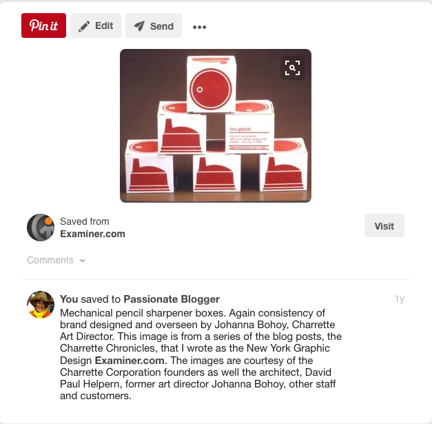
Mechanical pencil sharpener boxes pinned to Pinterest. This image is from a series of the blog posts, the Charrette Chronicles on Examiner.com. The image is courtesy of the Charrette Corporation and former art director, designer Johanna Bohoy
WHEN ‘KNOLLING’ WAS JUST A CHARRETTE CORPORATION LAYOUT AND BRANDING TECHNIQUE
The process of ‘knolling’ existed independent of Knoll and apparently previous to Andrew Kromelow’s coining a phrase for it. It was a prominent style designing with type, graphic design layout, architectural presentation and products branding including overhead or flat lay photography. One company that prominently exemplified this pre-knolling sensibility was the Charrette Corporation. The architect David Paul Helpern, designer of the NYC Charrette Corporation flagship store and the graphic design/branding designer, Johanna Bohoy, the Art Director at Charette’s Headquarters in Woburn, Massachusetts were responsible for its conception. This can be traced back to the early 1980’s rather than the late 1980’s when the term knolling was coined.
Trays of Charrette’s design tools laid out like in an orderly fashion like fine jewelry in 1982.
More trays of Charrette’s design tools laid out like in an orderly fashion like fine jewelry in 1982.
There is a series of articles about the Charrette Corporation written by me, the NY Graphic Design Examiner on examiner.com. Many samples of their forward-thinking graphic design and branding style are included. Suffice to say, whether it is called knolling or attributed to the earlier Charrette Corporation methodology, the result is very calming on the brain to observe objects in an orderly rather than chaotic manner. This seems to be especially true for artistic, creative brain dominant people.
Charrette Corporation Layout and Branding Compiled around 1982
Charrette Corporation Layout and Branding Compiled around 1982
TECHNOLOGY TAKES ON KNOLLING
To add to this, technology has taken leaps, specifically with the creation of social media venues which facilitates present day knolling. But according to my research, history clearly illustrates that the clean, perpendicular and parallel lined style of graphic design layout, now known as knolling, was not a revolutionary idea and did not begin with Florence Knoll or Andrew Kromelow in 1987. This is not to deny that the advent of social media has allowed knolling to become very practical, even pedestrian in its incarnation as ‘flat lay photography’. Layout and branding are now easily and attractively showcased by Instagram, Pinterest and Tumblr, pictured directly above and below.
What is Knolling? The Overhead Photography Trend Explained Looking for an easy way to incorporate some knolling into your next project? We’ve got you covered. From CreativeMarket.com
CONCLUSION
Life has a way of providing what is needed at a particular time in history. Credit it to The Charrette Corporation, Florence Knoll, Andrew Kromelow or Tom Sachs. They have all played a part in transforming the disciplines of design layout and branding forward to another level of usefulness and appeal in the world of product marketing. But is there more to it than that?!
From luisamaria.ac on Instagram. Photo from CreativeMarket.com Another simple but great knolling photo on Instagram comes from luisamaria.ac. Rather than group items by category or type, she created a photograph that was themed by color. This knolling photograph is predominantly orange and features a toy moose, a notebook, flowers and more.