Pre computer drafting tools are the precursor to what the computer came to be able to produce. In fact several great manual tool companies existed during this pre computer time. One happens to be, Keuffel & Esser.
History of Keuffel & Esser History of K & E from Wikipediaa metal tool box with a USC School of Architecture sticker on it
My Interest in K & E In 1966 when I entered the School of Architecture & Fine Arts at the University of Southern California, personal computers were not yet available. At that time, everything had to be drawn by hand in other words with pre computer drafting tools. This meant that tools such as a drafting set were particularly essential. As a result, I bought what I could collecting the best.
my K & E drafting set bought in the Los Angeles K & E store in 1966 when I majored in Architecture at the University of Southern California
The Charrette Corporation
Decades later, I worked for the West Side Highway Project in Lower Manhattan. That was just about the time that the dynasty of K & E pre computer drafting tools ceased. Meanwhile another great company was born, the Charrette Corporation. Read all about the Charrette Corporation in a series of blog posts that I wrote.
The Charrette Red Van Equally unique to Charrette was the red van that made trips every evening between the Boston (Woburn) warehouse and NYC for its high end clients. Quality was as much a part of Charrette’s service as it was of the products themselves.
Pencils There were several kinds of pencils considered highly functional during the pre computer time continuing to the present. Specifically, they ranged from wooden to metal mechanical. Currently there is one brand of pencil that is highly prized, the Eberhard Faber Blackwing.
The Eberhard Faber Blackwing Pencil available for $920.
T-squares, Triangles, and . . . When I began this post it never occurred to me how much there would be to write about. Therefore there will be more on this topic. But at another time.
We love stories. We can read a book or have one read to us. Perhaps a story is online or viewable on the multiplicity of media available. Ultimately, the result of the creation of an authentic story is a treat for us all. Besides entertaining, a story can be informative. In addition, it can promote a business or a product. Whatever the purpose, the process is basically the same. In this post, the focus is on the process.
The Creation of a Story
The process of creating an authentic story requires intensive research and lots of writing. I’ve created several stories containing the required elements. In all four authentic story situations, there was access to primary sources and extensive research. Sometimes having access to primary sources is impossible. So when it does happen, it can be very special for both the writer and the reader.
Four Authentic Stories
The authentic stories here touch upon four different non-fiction topics:
• business-a multi-million dollar corporation that started in a janitor’s closet
• social issues-The Middle Class Poor Crisis, a serious situation that exists today
• creativity-a creative-organizational process called Knolling
• music-some very special musicians
Each of these stories is set up as a series of blog posts. To read each of them, click on their link. That will be the first post of the story. You will be able to read the additional posts from there.
The Story of A Corporation That Started In A Janitor’s Closet
• The Charrette Corporation Chronicles The Charrette Red Van Travelled from Boston to New York Daily Long Before The Invention of Federal Express Overnight Delivery.
A Social Issue called, ‘The Poor Middle Class Crisis’
Part Three was written by me, Alison D. Gilbert, The New York Graphic Design Examiner. It was published by the Examiner.com on February 4, 2011.
Charrette meets the ‘Big Apple’
THE BIG APPLE
It was not long after its official birth in 1964 that the owners of the Charrette Corporation, a well-established New England design supply institution, realized the opportunity to spread its wings and expand. The need for their multi-dimensional approach to the sale of design supplies was not limited to architects or its Massachusetts borders. Between 1968 and 2002, Charrette opened a total of 26 locations in 16 states, as far west as Chicago and Detroit and as far south as Washington, DC. The need that co-founders, Lionel Spiro and Blair Brown, had identified as students and started in a Harvard Graduate School of Design closet, was not exclusive to architectural students but was viable for designers and students everywhere.
According to Lionel, who came to be in charge of the NY stores, “In 1967, the first NY store opened. It was located on the second and third floors of 139 East 47th Street. After a short time, the need for a better and larger location was apparent and the store moved to a brownstone building at 212 East 54th Street.
“Its showroom/store area was on the main floor and some storage was in the basement. By then, Charrette ran a truck from Boston to New York every night which enabled customer orders and store restocking to be done from its 125,000 square foot warehouse containing 36,000 different items. This enabled Charrette to accept telephone orders from customers in NYC up to 5:30 and deliver the orders with a 96% fill rate, the next morning.”
When the parcel of land containing the Charrette store on East 54th Street was demolished to make room for the ultra-modern ‘Lipstick Building’, the store had to move once again choosing a larger space at the corner of Lexington Avenue and 33rd Street.
The establishment of Charrette’s permanent New York home necessitated the skills of an architect to design their very own showplace from a barebones office space in the design district. For this task, Lionel turned to one of his Harvard Graduate School of Design classmates, New York based architect, David Paul Helpern. Mr. Helpern is still practicing and it was possible to interview him to learn more about the design and building of the showplace that was Charrette’s home for 20 years. Upcoming articles in this series will include excerpts from that interview and more about Charrette’s NY graphic standards.
LINKS TO THE CHARRETTE CORPORATION CHRONICLES: PART ONE THROUGH FIVE
Part Two was written by me, Alison D. Gilbert, The New York Graphic Design Examiner. It was published by the Examiner.com on January 14, 2011.
The Harvard Graduate School of Design LogoBORN IN A HARVARD CLOSET
Charrette did not enter the New York scene until a few years after its birth. It was actually born (although not yet named) in a closet at the Harvard Graduate School of Design. The idea was to house in one location all the supplies design students would need. This eliminated the need to take the time to travel to a dozen different locations to gather all the materials required for their projects.
As strange as the name Charrette sounds, anyone who has attended design school or has worked in a design office knows what a ‘charrette’ is. When students and professionals (particularly) in architecture stay up all night to meet a deadline, they say that they are “en charrette” or they are “charretting”.
The term came from the Ecole de Beaux Arts in Paris, which in the 19th century was the leading school of architecture in the world. When deadlines arrived, a CHARRETTE, the French word for wagon, would be pushed through the building and students had to place their drawings on the “charrette” or they would not be accepted.
Many students would actually sit or straddle the wagon as they signed their work or put down the last few lines. Students came to study in Paris from all over the world. When they graduated and returned home, they used the term “en Charrette” to define the last effort to finish a design project. This description applies primarily to the architecture and planning fields.
According to Lionel Spiro, since he and Blair Brown, the founders of Charrette, only planned to supply architects, they chose the name that they felt had special significance to their targeted market. However within a short time, Charrette was discovered by a succession of design professionals who used many of the same products.
Eventually manufacturing companies such as Raytheon, Ford, GM, and Chrysler eventually turned to Charrette for the majority of their design and engineering drawing needs. In addition, Charrette was discovered by hundreds of relatively small design offices within much larger government agencies in Washington.
Also included were structural, mechanical and civil engineers and later other engineers including electrical and electronic engineers. Commercial (graphic) designers, product designers and other creative people working at ad agencies, media firms and even television shows like Saturday Night Live became regular users of Charrette products as regular New York customers.
LINKS TO THE CHARRETTE CORPORATION CHRONICLES: PART ONE THROUGH FIVE
These chronicles of The Charrette Corporation first appeared on the Examiner.com, written by me, Alison D. Gilbert as the New York Graphic Design Examiner. This story includes primary research, most importantly interviews with the founders, Lionel Spiro and the late Blair Brown. In addition, many former corporate staff members, store employees and even customers all graciously gave their time to tell me their experiences and so many wonderful stories.
Examiner.com ceases to exist this month, July of 2016, five and a half years after I started writing for them. The Charrette Chronicles and other posts would perish without transferring them to my own blog. The Charrette Chronicles appears here as a series of five posts. This introduction, Part One, was originally published on December 10, 2010.
The red Charrette van made overnight deliveries of much needed supplies from the warehouse in Woburn, Massachusetts to clients in New York City. This was long before the existence of FedEX and all the other overnight delivery services even existed.
INTRODUCTION
No story about Graphic Design in NY would be complete without at least mention of the establishments, new, old, and gone that have supplied the design industry with the many, unique tools it required primarily BC (before computers) and through the transition to AD (age of digital). In compiling a list of them, one store stood out so distinctly that it deserves an entire article, if not series of articles about it, Charrette.
So much research for this designer supplies institution has been accumulated that there is an entire ‘back story’ to this examiner.com series. It details the process of using the Internet to unearth materials and people. Many of them have been extremely generous in coming forward to share their experience and memories about this wonderful but extinct designers supply company that was founded in Cambridge Mass in the mid 1960’s.
This story is an attempt to go back in time and capture the years of glory Charrette held in the industry, in general, and in NY, in particular. It will include facts about its lifespan of several decades and some of the key players involved. It is a very moving story and one that any author can only hope to be worthy of writing.
Since the materials that have been so generously donated, lent and found on-line are still accumulating, this piece will serve simply as an invitation to the graphic memoir of Charrette, It had stores at three NYC locations. First it was on 47th Street, then on East 54th Street (before the brownstone building it was housed in was torn down to make room for the ‘Lipstick’ Building, Finally it was relocated to its homage to modern design, a frontage of glass and red metal in the design district, the East 30rds. How fitting a stage upon which to continue this story.
LINKS TO THE CHARRETTE CORPORATION CHRONICLES: PART ONE THROUGH FIVE
This series of blog posts about KNOLLING is dedicated to Andrew Kromelow who coined the term ‘knolling’ in 1987 and to Tom Sachs who expanded on the concept of knolling to ‘Always Be Knolling’.
What Is Knolling? From 10 Bullets. 2009 by Tom Sachs Posted on the CreativeMarket.com Blog, August 19,2015INTRODUCTION
Knolling is defined in Wikipedia as “the process of arranging related objects in parallel or 90-degree angles as a method of organization”. The original phrase, knolling, was coined in 1987 by Andrew Kromelow, a janitor in the furniture fabrication shop of Frank Gehry. Gehry was designing chairs for the legendary, Knoll Furniture Company. Kromelow was particularly impressed with the furniture designed by Florence Knoll.
HISTORY OF KNOLL FURNITURE
Florence Knoll furniture designs which Andrew Kromelow admired for their clean, angular lines. From http://www.knoll.com/designer/Florence-Knoll
ANDREW KROMELOW
Andrew Kromelow especially liked the clean, angular lines of Florence Knoll’s designs which can be seen above. As a result, at the end of the workday, Kromelow would collect all the tools that had been left out in the work studio and organized them in a similar geometric manner then photograph them from the top. No photographs of Kromelow’s work seem to have survived, publically.
Tom Sachs—”Always Be Knolling.“ from Ten Bullets on Tumblr, “Things Organized Neatly”
The above image from Tom Sach’s, Ten Bullets, #8: “ALWAYS BE KNOLLING’ suggests what a Kromelow ‘flat lay-overhead photo’ might have looked like.”The result was an organized surface that allowed the user to see all objects at once”. Kromelow referred to this as ‘knolling’ due to the idea’s inspiration from Florence Knoll’s design sensibility. The term, the concept and the ‘flat lay photography’ Kromelow made of his arrangements caught on thanks to another person in Gehry’s employment.
“ALWAYS BE KNOLLING”
Tom Sachs, an artist and sculptor who also worked in Gehry’s studio, popularized Kromelow’s knolling and his ‘flat lay photography’ process. According to the blog post in CreativeDesignMagazine.com, Sachs created a piece about knolling and adopted the phrase, “Always be Knolling” (or ABK for short) as a motto for his work. By 1987, knolling had officially become a trend. But what transpired between 1987 and 2009?
One wonders because nothing more seems to be available about it again until the 2009 blog post on CreativeMarket.com, ‘What Is Knolling? The Overhead Photography Trend Explained’. Supposedly, this style of organizational layout has been used for over three decades to shape brands and sell products. No examples were available. Instead, decades before the social media venue, Instagram, had the popular account, ‘The Flat Lays’, before the existence of social media at all, and separate from Kromelow’s organizing technique, knolling existed as a graphic design layout and branding inspiration. But it was not known as knolling and it was before 1987.
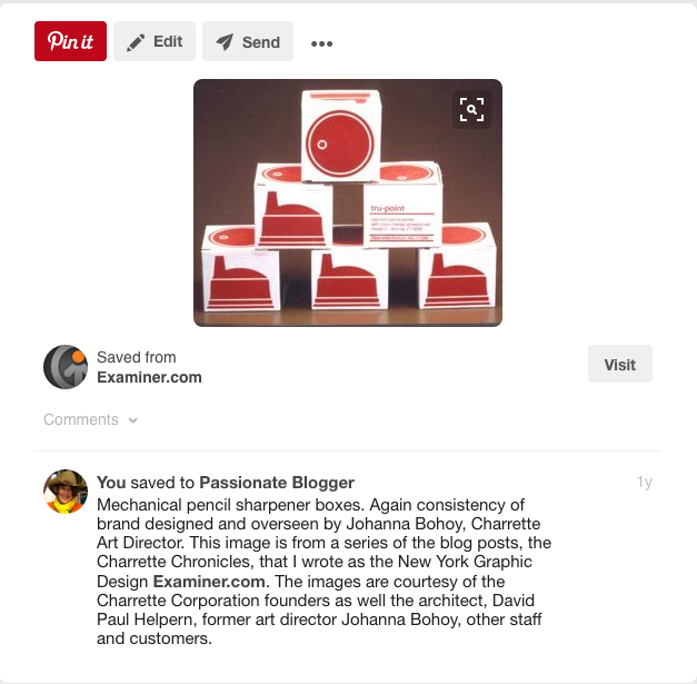
Mechanical pencil sharpener boxes pinned to Pinterest. This image is from a series of the blog posts, the Charrette Chronicles on Examiner.com. The image is courtesy of the Charrette Corporation and former art director, designer Johanna Bohoy
WHEN ‘KNOLLING’ WAS JUST A CHARRETTE CORPORATION LAYOUT AND BRANDING TECHNIQUE
The process of ‘knolling’ existed independent of Knoll and apparently previous to Andrew Kromelow’s coining a phrase for it. It was a prominent style designing with type, graphic design layout, architectural presentation and products branding including overhead or flat lay photography. One company that prominently exemplified this pre-knolling sensibility was the Charrette Corporation. The architect David Paul Helpern, designer of the NYC Charrette Corporation flagship store and the graphic design/branding designer, Johanna Bohoy, the Art Director at Charette’s Headquarters in Woburn, Massachusetts were responsible for its conception. This can be traced back to the early 1980’s rather than the late 1980’s when the term knolling was coined.
Trays of Charrette’s design tools laid out like in an orderly fashion like fine jewelry in 1982.
More trays of Charrette’s design tools laid out like in an orderly fashion like fine jewelry in 1982.
There is a series of articles about the Charrette Corporation written by me, the NY Graphic Design Examiner on examiner.com. Many samples of their forward-thinking graphic design and branding style are included. Suffice to say, whether it is called knolling or attributed to the earlier Charrette Corporation methodology, the result is very calming on the brain to observe objects in an orderly rather than chaotic manner. This seems to be especially true for artistic, creative brain dominant people.
Charrette Corporation Layout and Branding Compiled around 1982
Charrette Corporation Layout and Branding Compiled around 1982
TECHNOLOGY TAKES ON KNOLLING
To add to this, technology has taken leaps, specifically with the creation of social media venues which facilitates present day knolling. But according to my research, history clearly illustrates that the clean, perpendicular and parallel lined style of graphic design layout, now known as knolling, was not a revolutionary idea and did not begin with Florence Knoll or Andrew Kromelow in 1987. This is not to deny that the advent of social media has allowed knolling to become very practical, even pedestrian in its incarnation as ‘flat lay photography’. Layout and branding are now easily and attractively showcased by Instagram, Pinterest and Tumblr, pictured directly above and below.
What is Knolling? The Overhead Photography Trend Explained Looking for an easy way to incorporate some knolling into your next project? We’ve got you covered. From CreativeMarket.com
CONCLUSION
Life has a way of providing what is needed at a particular time in history. Credit it to The Charrette Corporation, Florence Knoll, Andrew Kromelow or Tom Sachs. They have all played a part in transforming the disciplines of design layout and branding forward to another level of usefulness and appeal in the world of product marketing. But is there more to it than that?!
From luisamaria.ac on Instagram. Photo from CreativeMarket.com Another simple but great knolling photo on Instagram comes from luisamaria.ac. Rather than group items by category or type, she created a photograph that was themed by color. This knolling photograph is predominantly orange and features a toy moose, a notebook, flowers and more.
The Charrette delivery van @ The Charrette CorporationHow It Began
What began as a single article, written by me as the NY Graphic Design Examiner, evolved into a series of articles, seven in total, that spanned a year’s time to complete. Although the time to compile all the materials, including researching, interviewing primary sources and so on did not take a full year, a new assignment as an author for The Digital Brand Marketing Blog took me away from the project for sometime during that year. In fact, this multi-author blog has made it to the semi-finals of the Social Media Examiner’s Top Ten Blogs 2012 competition.
But it was overdue to be completed, as hard as it was to write a Charrette Corporation fond farewell. It was like a long ‘good bye’ that no one wants to make when dear friends must part. But it had to be done. Essentially, I knew what the final article would be about, the store designed by architect, David Paul Helpern, a fellow student of Charrette Corporation founders, Lionel Spiro and Blair Brown, who all attended the Harvard Graduate School of Design. The store, located on Manhattan’s East side on Lexington Avenue in the East 30’s, was the Crowning Jewel of the Charrette NY retail side.
Although the commercial accounts handled by a sales force that covered much of the East Coast and into the Midwest were much larger than the retail side sales, the retail side was the face of the corporation. This gave Charrette the opportunity to show the world the ‘stuff it was made of’. As the tip of the iceberg, it glistened in the sun and shone like a well-polished gem. The flagship store was the ultimate representation of the Charrette brand.
It was a company whose name was synonymous with quality. The tools and supplies manufactured for and sold by Charrette had to be of the highest quality. The pedigree that resulted from employment at the company practically guaranteed future employment anywhere when the time came for someone to move on.
The Charrette corporate culture, philosophy and brand development was such that it is possible that other retail corporations fashioned their stores after Charrette. They were clean looking with simple straight lines, well designed, displaying everyday items as if they were high end designer merchandise.
The generosity of everyone was as real as the quality of the Charrette inventory. The Charrette culture had affected everyone who came in touch with it. The writing of this story took on a life of its own, a life that also had to be written in a way that gave credence to this corporate culture and all its glorious history.
So I wrote and wrote and wrote. When would it end? How would it end? Numerous months’ hiatus from the writing became awkward and the pressure to finish overcame the same lingering feeling of not wanting to say good-bye. But at the same time, it was clear that the final tribute had to be made and how to do it.
That is where The Charrette NY Crowning Jewel came into the picture. It was a store that was written up in two nationally respected professional magazines, Interiors (February 1982) and Visual Merchandising (June 1982), had a grand, grand opening and one that was built to design specifications. It was glorious. Everything about it and in it was a designer’s dream. In addition, the place, their products, and award winning packaging designs were featured in two nationally renowned design magazines, Communication Arts (March/April 1982) and Print (May/June 1982).
And then, in spite of the attempts to keep up with the times of transition from analog to digital design, it was time to let go. No more founders, some staff stayed, some staff went. The era that was the original Charrette was gone. The company was bought by a succession of other companies. It even became known by different names. But the culture and the philosophy could not be packaged, bought and sold.
Gone but Never Forgotten, A Charrette Trailer @ 2011 Christine Miller, former Charrette employeeHow It Ended
So it was time to say good-bye, for all of us, the founders, the staff, the customers and even this author of a series of articles that became the Charrette NY Chronicle that took a year to write. It is all over. But much will live on in the minds and memories of those whose lives were touched by the experience of their involvement.
There is a Charrette Alumni Group on Linkedin. I am the only civilian to have the honor of belonging. There is also an Internet photo archive on flickr. Finally and in some small way, it is my sincere hope that the Charrette Chronicle will be part of this legacy. It is dedicated to all the wonderful people who let me into their lives and shared their stories so that I could write a series in honor of them and their Charrette experience. Thank you all. I wish you a fond farewell. You shall never be forgotten, Charrette Corporation.